Line Weight Drawing Rules in Car Design Sketch
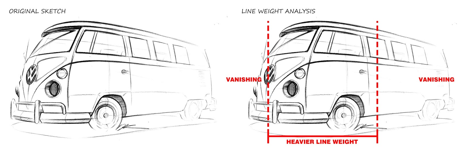
Professional designers use a lot of useful techniques to describe forms, and line weighing is one of the most useful techniques to present your design effectively. Additionally, line weighing is not only used for car design but also normally used in the other sectors such as engineering and architecture drawings to communicate with the complexed forms. Today, I will suggest how you can use heavy lines in a drawing to help in improving the quality of the sketch and visualise your idea effectively. The car I drew to analyse was a Volkswagen Camper Van.
To understand how line weighing works, you have to possess a sense of how perspective works and where vanishing points are. You can normally use thicker lines in the front of the object to make your sketch more active and dynamic.
<Three ways you can use line weight effectively>
1. Use line weight to communicate depth.
There are certain parts where you may want to use thick lines to differentiate depth. For example, the outline of the wheels are drawn with thick lines to differentiate wheels from the main body. Another example is the frame of the windows as they are empty inside.
2. Use line weight to prioritize and emphasis the form you want to show.
As you give more weight in the lines in the surfaces that are closer to your eyes, you can make the object more 3 dimensional and attract more attention.
3. Use line weight to differentiate your design against the background and construction lines.
If you have a lot of construction lines behind your design, it will look confusing and messy. Using the thick lines, you can capture the outlines and details of your design.


Comments
Post a Comment